People like to say, “Appearance is everything..”. When it comes to art and design, that isn’t necessarily correct, but when it comes to Adobe Illustrator, these words have never been more true.
The appearance palette in Illustrator is an often overlooked resource that holds immeasurable amounts of power, requires little experience to use it properly, and can speed up your workflow, regardless if you’re a beginning or professional designer.
In this tutorial, we are going to quickly discuss the benefits of using the appearance palette, and some basic techniques you can use to create very sophisticated designs, that would generally require multiple layers.
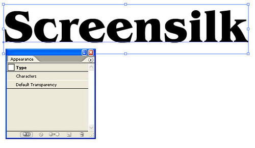
Let’s open a new file in Illustrator, and quickly add some text to our page.
If it isn’t already visible, let’s go to Window>Appearance and open our Appearance palette. After selecting our text, this is what we should see.
Doesn’t look like much, I know, but let’s double click on the character layer.
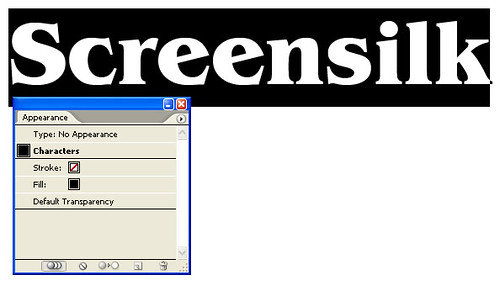
Ok, now this is starting to make sense. This is showing that we have a no stroke color, a fill of black and default transparency applied. Great, but I think we all could have figured that out with out having to open a palette to tell us.
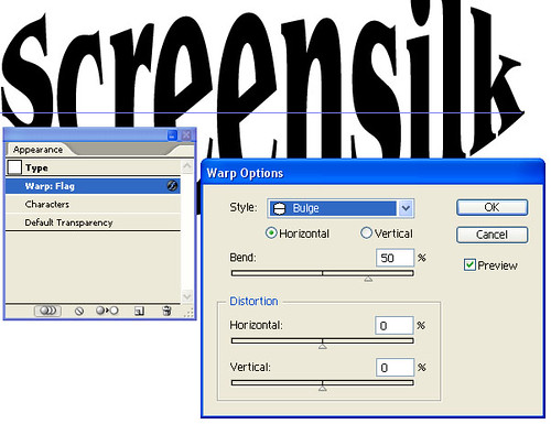
So, let’s apply a warp to the text to add some interest to this design.
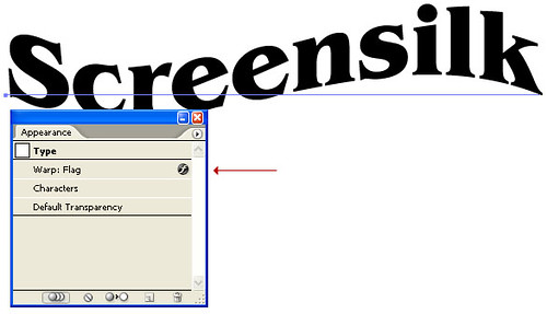
Our appearance palette is now listing the warp we applied, as well as the type of warp (i.e. Flag). Double clicking this entry will bring up our warp menu and allow us to quickly adjust, or completely change the effect. That’s kind of cool, but there’s more.
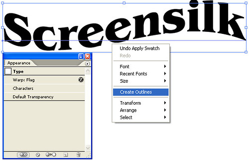
Ok, since I am happy with the wave I have applied, and I want to start adding color and effects to this design, I am going to right click and select Create Outlines. This is going to turn my text into an object, and allow me to start applying some cool effects to my text.
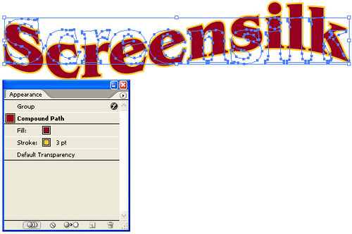
Firstly, I want to add some color to this design. I am going to add a Red Fill and Gold Stroke of 3pt.
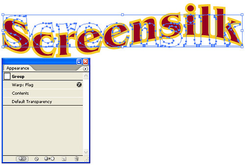
Oh man, that looks awful. Thankfully, the appearance palette has me covered. Double click the contents entry, and you will be presented with their attributes. Clicking on the stroke attribute and dragging it blow the fill attribute, will clean up our text, and provide the look we originally expected.
Cool, that was easy enough. So, I am thinking I want to add a subtle bevel to this text. In order to produce that effect, I am just going to create a new stroke, and place it on top of my text. So, with the text selected, click the stroke attribute on the appearance palette, and click the “Duplicate Selected Item” button, along the bottom of the palette window (It looks the same as the new layer button on the layers palette). This adds an additional stroke to our object. Let’s click and drag that stroke above our fill attribute.
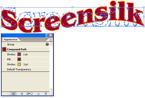
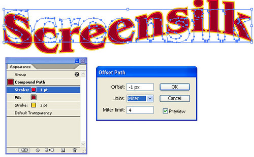
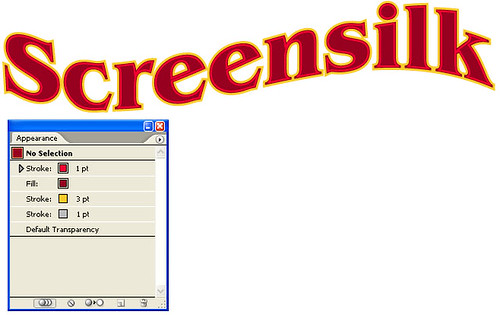
Hmm, not exactly the effect I was hoping for. I really need to offset this stroke inward a couple of points. Luckily, there is a way to do that. On the Illustrator menu bar, select Effect > Path > Offset Path. This will bring up the offset path effect menu. For my text, I just want to reduce the stroke slightly, to create a bevel, so I set it to -1px and click ok. That’s better.
Now, I want to add a slight 3d effect, to add some depth to the design. To do that, I am going to add another stroke in my appearance palette. Just as before, with the text selected, click the stroke attribute on the appearance palette, and click the “Duplicate Selected Item” button, along the bottom of the palette window. I want this to be a 1pt grey stroke, behind the gold stroke. So, I click on the new grey stroke and drag it below the gold stroke on the appearance menu.
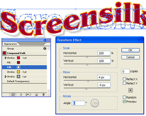
In order to get the 3d effect, I need to move this grey stroke down and to the right. To do so, with my text selected, and the grey stroke highlighted in the appearance palette, select Effect >Distort & Transform > Transform. I want to move my stroke 4 pts on the horizontal and -4 pts on the vertical. Click Ok, when you have it how you want it.
10 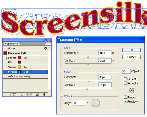
I am liking how it looks, but I think to help add some depth to the design, I will add a slight drop shadow. With the text selected, choose Effect >Stylize > Drop Shadow. I am going to offset it slightly by 3pts, and just keep it subtle with a 20% opacity. Click OK.
Looking at it, I really would rather the area between my text and the grey offset stroke we created be a solid color, so that the drop shadow is actually behind my design. With our appearance palette, this should be a simple change. With our text selected, select the fill attribute and create a duplicate. Drag that duplicate below the original fill and change it to white. Then, just like we did with the grey stroke, we select the white fill attribute, select Effect >Distort & Transform > Transform and move our fill 4 pts on the horizontal and -4 pts on the vertical, click Ok.
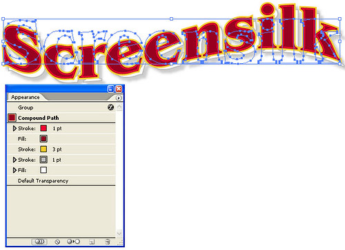
Much closer, let’s just drag our white fill attribute to the bottom of the appearance palette, below our grey stroke. There we go, almost perfect.
To finalize my design, I adjusted the inner red stroke to be .5 pt, and I added a gradient to the fill. As a side note, when adding a gradient, either do it as the last step in your design, or create it on a new layer. The reason being is that once you have a gradient applied, each letter in your text will have different attributes, preventing you from editing the object as a whole. Below is the final design, after my minor changes.

So, as you can see, the appearance palette is a powerful, versatile tool, for any designers collection. With the ability to quickly and efficiently create complex images, your design workflow will never be the same.
Want to check out the file I made? No problem, download it here: Illustrator Appearance Palette Tutorial File
If you enjoyed this tutorial, or found it helpful, let me know! Did you create something great with the appearance palette? Post it in the comments, or on the forums.
Thanks!
Screensilk
If you have found this article useful please feel free to share it at any of the following social bookmarking sites: