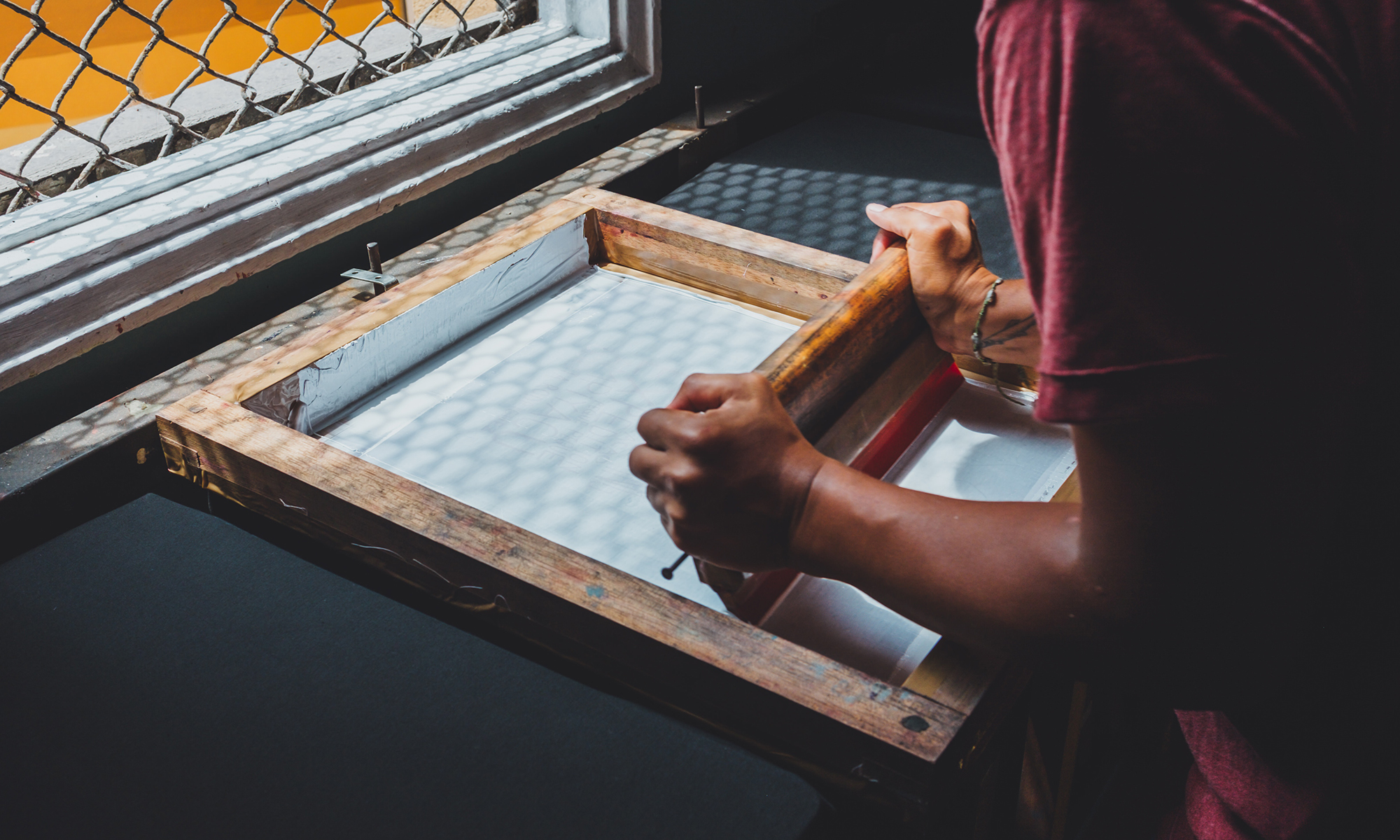
Ever wonder how t-shirts are made that feature photographic quality design, in full color? This articles takes an in-depth look at the subject of cmyk printing and color separations, and their uses in screen printing. This casual approach to a difficult subject, should provide you everything you need to know to start producing full color artwork for fun and profit.
So, you’re interesting in finding out about creating color separations for 4 color process screen printing?
To tell you the truth, you’re not alone. Many people ask me, but I have been hesitant to trust this information with you (or anyone else for that matter), because of the power you will have at your finger tips once I am through. This isn’t a power to be taken lightly, with this power you can change the world.
I know, who are we kidding? I can see that certain something in your eyes. Something in there that says, “Hey man, I want it quick and easy, and don’t make me think.” I feel ya homey, so here’s my advice,
Let a professional do your separations for you.
See, that wasn’t so hard. You feelin’ the power, man? Have fun, we’ll catch ya on the rebound.
What? Really? You want to do it yourself? I mean, wouldn’t you rather just hire a professional, pay outrageous fees, and not have to bore yourself with the advanced mathematics and the tedious process of memorizing formulas and stuff?
Ok, then.. But don’t say I didn’t warn you! And when your family starts sending me emails because your head exploded from this advance knowledge, you can bet I will sell their email address to some head implant specialist mailing list, and make a fortune off your tragedy. Are we still cool? Alright then.
So, what is CMYK anyways?
Well, by Wikipedia’s definition, “CMYK is a subtractive color model used in color printing”. Yup, that pretty much sums it up.
So, now that we have that out of the way, let’s get onto something interesting….What? You still don’t understand? Really? I thought that was pretty clear, but I will try to explain it for you.
This whole CMYK thing is based on the mixing of specific pigments in particular percentages to create a wide range of colors. Often times referred to as 4 color process. These specific pigments are as follows:
- C=cyan
- M=magenta
- Y=yellow
- K=key (black)

Now, the reason this is considered a “subtractive color model” is because the higher percentage of cyan, magenta, and yellow I smear onto a white sheet of paper, the less amount of light that will reflect through, ultimately creating a black (in this case, smudge) on our paper.
Why is black referred to as the letter “K” in CMYK? Well, back in the old days, when people really did use silk for screen printing, the word for black was actually Klack. What? Oh.. well, apparently that isn’t true. Allegedly, the K actually stands for Key, as in the key plate used by a printer. I am being told that it was referred to as the key plate because it generally contained the artistic detail for a piece and was usually printed in klack.
Er, ok…
black.
Ok, thanks for the tip! So can we make a screen now?
Hold up a second. There is actually a bit more to discuss before we can dive in and start burning screens. Understanding what CMYK is and why it does what it does is really only the first step to moving forward into four color process printing.
Next we need to understand color separations. I had mentioned earlier how specific percentages of these particular pigments (cyan, magenta, yellow, and black), could be combined to create a wide range of colors.

Just for kicks, lets pop open Photoshop and take a quick look at the percentage breakdown of a color.
How about this grass green?

Ok, so this is a pretty solid green. He looks to have his act together. Maybe a summer home on the cape, a nice car, a pretty little pink number he comes home to every night. But, if we look close we can see that this guy is just holding it together. In order to stay this solid green, he really needs to maintain some tight percentages. If one of these percentages starts to slip, he starts to lose his solid reputation.
So how does all this nonsense relate to color separations?
Well, there is a point, I know it. Let me see… We took a look at a color ( in this example, green), we examined the percentages that make him the successful color he is:
- Cyan = 75%
- Magenta = 5%
- Yellow = 100%
- Black = 0%

We understood that all together, these color percentages make him what he is, but when they are separate, they are just percentages of color by themselves. Oh snap! Did you see what I said? When they are separate! So, pulling these colors away from each other into individual instances, is the act of creating color separations. And with color separations, we can make screens!
Wait a second, how are we going to print a percentage of color through a screen?
Oh, ya.. I almost forget about that part. Halftones. What? No, no it’s not a ska band. A halftone is the series of little dots you see when you look at a photograph in a newspaper. Halftones are dots of varying sizes and angles. The smaller the dot, the more white from the paper shows through effectively creating a lower percentage of color. The larger the dot (yup you guessed it), the higher the color percentage and the less white that shows through. When these dots are angled just right and printed over each other with their corresponding ink color, the effect is breath taking. These little dots, of varying sizes and colors, standing up against their diversities, united under a common good, to change our perception of the world around us. Or, in other words, they just appear to make some really pretty colors.
Ok, Cool! I got it, colored dots is the key. Let’s do this!
Wait one second mister, we still need to talk about mesh counts, diameters and LPI’s.. Oh My!
Ok, yeah, I admit… that Wizard of Oz reference didn’t really work. But, I think after everything we have been through together, we can let that one slide.
Ok, so where do we start. We have discussed how CMYK color separations require halftones in order to achieve the multitude of colors we want in a 4 color process image. There has been mention of dot sizes and angles that are necessary to achieve this effect properly. You may have noticed that I have yet to give you any solid numbers as far as dot sizes or angles for your halftones. I didn’t do that so you would read through to the end of this article…, if that’s what your thinking. I did that because this is where I supply you with the facts and figures you need to make this work for you in the real world.
Let’s start at the end and work back to the beginning. Mesh Count and thread diameter. Mesh count is the number of threads, per inch, that makes up your screen. Professional screen printers generally utilizes a screen with a mesh count of about 255 threads per inch and above, but typically mesh counts can range anywhere from 110 to 305. To make matters worst, there is also different thread diameters for screens. The higher your thread diameter in combination with your mesh count, the finer detail your artwork can contain, but also, the less ink that gets pushed through the screen. Inversely, the lower the thread diameter, the more ink that can be pushed through the screen, but the ability to maintain high details is lost.
So how do you go about choosing a mesh count? Well, for the sake of this article, and the process of 4 color printing on a screen, we want to go with the highest possible mesh count with the largest diameter of threads suitable for the material we are printing to. The higher our mesh count, the tighter our dots can be when we create our halftone.
Now, this is where the magic happens. In order to output a proper halftone, using the highest possible quality for our screen, we need to do some math.
First, we need to look at our mesh count, we can call that M. In order to figure out the optimal dot size of our halftone for our screen, we need to divide M by 3.5. Why 3.5 you ask? Mostly, because I like that number and have good result with it. But, because there are differing ideas of what number to use, most ranging anywhere from 3 – 5, feel free to experiment and let me know what works best for you.
The quotient of this formula will become our LPI, or lines per inch.
M / 3.5 = LPI
Our LPI will dictate how many lines per inch we will have in our halftone. The higher our LPI, the more dots we can fit in per inch in our halftone, allowing us the ability to print a higher quality image.
The LPI of your halftone can have a huge impact on the quality of your print. Below is a quick break down of typical LPI standards for reference.
- Screen Printing 45-65 lpi
- Laser Printer (300dpi) 65 lpi
- Laser Printer (600dpi) 85-105 lpi
- Offset Press (newsprint paper) 85 lpi
- Offset Press (coated paper) 85-185 lpi
Let’s do a quick example of figuring out our LPI, and then we can move on to the awesomeness of angles. Let’s say I have a screen with a mesh count of 220 threads per inch. If I divide that 220 mesh count by 3.5, I get a quotient of roughly 63. Looking at our reference table, that will produce a lower quality halftone than used in newspapers, but fairly average for screen printing. While it might be ok for this example, I would probably look at buying a higher mesh count screen to improve my halftone frequency.
Also, as a side note, if you don’t have the screen yet, but now you want to achieve a halftone with an 85 lpi, you can always reverse the math to come up with the mesh count you should purchase. Always remember to round up if possible. Obvious? Maybe, but I thought I’d mention it.
LPI * 3.5 = Mesh Count
Angles, Don’t believe the Hype
Ok, we’ve made it this far, just a couple more paragraphs and then the big payoff.

The final key to producing accurate 4 color halftone separations for output is the screen angle. Not the silk screen, the halftone screen! The series of dots that create the halftone are referred to as a screen. It is this screen, that once overlapped with the other color screens creates the final image. Each separation screen is printed at its own angle to prevent what is commonly referred to as the moiré effect. Moiré produce a sort of distorted, dizzying effect, and can ruin a good print job. To prevent moiré patterns in your prints, a general rule of thumb is to offset each screen angle by 15 to 30 degrees.
Here is a sample of suitable screen angles:
- cyan = 75°
- magenta = 15°
- yellow = 105°
- black = 45°
With these angles in hand, and all the knowledge you gained earlier, you are ready to start outputting separations for creating your screens.
If you have found list article useful please feel free to share it at any of the following social bookmarking sites:
Thanks, very helpful. One quick question: For best results are you printing the 4 colors in a row, wet, or do you flash dry inbetween colors?
Thanks for the wonderful insight into screen printing, I’m just a little confused when you say offset screen angel by 15 to 30 degrees. What are the original values to offset it from? And how do you get to a suitable screen angle sample of c-75
m-15 y-105 k-45. I apologize if this sounds like a stupid question and if I am missing something simple.
Just read through this. Thanks for the info! Really aided my understanding.
I think I understood everything, but the end part is a bit confusing to me still. If it is not the actual silk screen that is being offset, what screen is it? I know it’s the halftone screen you are talking about, but where would that be exactly?
Asking because I can’t see where the halftone angle printing would come in between printing your positive on the vinyl and then burning the positive image into the screen. ( I’m new to this. Just trying to understand before I start off manually doing it )
Great explanation on how the four color process works. The angles worked great for outputting separations, thanks for putting this out there for us to see!
-Mike
Good article! Always wanted to know how to screen-printing worked! Thanks for the post!! 😀
finally!!! this article answered my long-borne problem in color separation. you enlightened me bro! thanks! ur great.
Hi! This article was extremely helpful! I am teaching a class on color management and I was trying to convey a way to explain screen printing so that any student level could understand it!
Perfect!
Thank you,
Lisa
This article has been super educational for me! Thanks so much for taking the time to write it. There’s one part I’m still unclear about and that’s how to actually create silk screens from halftone artwork in photoshop. I totally get how the color separation works to create an image but I’m just not sure how to create multiple layers from this halftone pattern. HALP!
great article. lots of food for thought. No I need a primer on elipitical dot vs. round dot. If anyone can identify something good, please e-mail me.